

Enactus Sydney
Enactus Sydney
About
-
An end-to-end ux project with the goal to optimise the client’s current website from the researched pain points and client’s requests.
-
Enactus is a student-led non-profit society gathering students brought together with the common goal of creating solutions to tackle social issues. With members coming from diverse faculty backgrounds, students engage in challenging global issues and develop their leadership and collaborative skills to become social innovators. Enactus USYD is part of a larger community of the global Enactus network, which extends nationally and internationally in annual competitions.
-
The client requested a page so that Enactus USYD members can access resources as easily as possible regarding projects. Also requested to have a dedicated space to submit anonymous suggestions, questions and complaints to the executive team.
-
Understanding our client → user research: online ethnography, competitor analysis, jobs to be done framework → data synthesis → user persona → problem statement → scenario making → creating sketches and wireframes → client meetings → design iterations → wireflow → hifi mocks → heuristic evaluation → prototypes
Research
This project investigate the client’s needs through online ethnography, competitor analysis, affinity diagram and personas and evaluating jobs to be done and studying user profiles. The findings led to creating different scenarios our personas encountering outlining the pain points and journey of exisiting members using the client’s webpage.
Online ethnography
Apart from understanding our clients needs and requests, we started off by doing an online ethnography research to understand the members within the organisation more thoroughly. These steps were carried out to perform the research.

-
We picked Facebook and Instagram to ground the investigation because
Facebook is a commonly used platform where events can be created and therefore it is usually a way to invite people to join Enactus Sydney.
Instagram is a popular social media platform used by many university students. We were expecting to see updates of their social events and to see their current activities and how people are engaging with the platform.
-
Criteria are defined to better narrowing the scope of the investigation to make it more relevant.
We decided to investigate into
all posts in last 12 months with high engagement (comments/likes) to see;
What kind of info people are searching for and for what purpose;
Past events to see the engagement and responses of users;
Exposure rate of their posts;
Consistency of postings between diff platforms IG/FB.
-
We found out that:
Most comments and likes come from team members, they are usually active when post about new event;
Facebook page have more followers than their Instagram page; however, users participate more on Instagram;
People commenting consist of both non-Enactus and Enactus members;
People write supportive comments for their friends getting accepted into the team.
-
After the observation, it was suggested that;
Members have higher engagement rate about upcoming event or event they had successfully done;
People simply do not find the content posted on fb useful since there is little to no engagement on this platform;
Posts of people rather than general information garners more user attention;
They should have a page with FAQ's or hold a public Q&A or provide more info on their projects on their site since Culinary Tales and Enactus Sydney’s website does not specify the answer.
Competitor analysis
A competitor analysis was performed to understand Enactus Sydney’s rivalries. This research allowed us to outline the strengths and weaknesses of each organisations and suggesting how each weakness could be turned to an opportunity. An overview of the results are stated as below;

-
Strengths:
Website is so much more in-depth, they have an FAQ page to get quick answers;
They have specific emails to contact for each department if u have a complaint;
Past events to see the engagement and responses of users;
High exposure rate of their posts. - Consistency of postings between different platforms IG/FB;
The types of contents are high quality and related to Enactus UNSW.
Weakness:
Their website doesnt have an events page so that makes it harder for ppl to see whats happening.
-
Strengths:
They have a blog of events under the page "updates";
Project pages are descriptive;
Under the "join us" page users are able to apply to join projects through Google forms;
Easy to contact;
Website has sufficient information.
Weakness:
Hard to access Events page (need to click on specific event for events menu to appear);
No suggestions/complaints box.;
The website is pretty complexed, a bit difficult to navigate.
-
Strengths:
They have a dedicated Contact Us page (but it requires users to fill in phone number);
their Event page shows past events.
Weakness:
Projects page is under coming soon;
Events page cannot be analysed as it doesn’t show future events;
It is hard for ppl to keep up with events unless they click on the FB page link;
Homepage is almost empty.
Apart from the competitors, we carried out a detailed analysis of the client’s own website and identified some pain points in four main pages in their website.
Home page
Weakness:
Too much content (error in content distribution);
not interactive, lack of buttons and prompted fonts.
Opportunities & considerations:
Consider the distribution of content, putting only necessary content on the home page.
Make use of buttons and prompted fonts for links and open new windows.
Events page
Weakness:
No information on past events;
Current and upcoming events not updated.
Opportunities & considerations:
Consider adding a past event page.
Consider putting the ‘newsletter’ page into the Events page;
Introduce a calendar/ timeline to showcase all events.
Project page
Weakness:
Not interactive, hidden buttons and similar fonts for links;
Dull, not initiating next steps for interested users.
Opportunities & considerations:
Make use of buttons and prompted fonts for links and open new windows;
Introduce next steps so that members who are interested in joining/starting a project can begin.
Get involved page
Weakness:
Only ‘get in touch’ prompt instead of actual communications;
Lack of relevant info;
Only send to email CTA, it’s not inviting.
Opportunities & considerations:
Introduce a FAQ page so users can get questions answered even though in-charge personnel is not available to answer questions;
Consider replacing this page to ‘join us’ or an inquiry page.
Affinity diagram is carried out to synthesise data we got from the Jobs to be done framework


Personas

Alex Weng | 20 years old | 2nd year student | 2nd year member
Alex is a an introvert and hardworking who focuses mainly on his academic. Although a 2nd year Enactus member, he hasn't really participated in any events and projects. He thought he should start being active in Enactus as first year has passed and he thinks he can manage his co-curriculum well. He has been looking at the projects for some time and managed to get the guides and request form from one of the project manager. However, he thought the process was rather troublesome.
dependent level ★☆☆☆☆
proactivity ★★★☆☆
patient ★★★★☆
internet reliance ★★★★☆
-
To be able to really get to know the members.
Participate in Enactus events so that he can get influenced by the active members.
-
The logistic of starting a new project is cumbersome.
Reaching out to the executives has been a difficult process.

Jess Goulding | 20 years old | 3nd year student | new member
She's outgoing and keen to participate in uni events. She is a new member of Enactus USYD and wants to network with new students to find her common interests, passion for social issues and entrepreneurship. She would like to participate in any upcoming events but she isn't sure where to find the events and how to join them. Because of this, she feels like she is not learning much and being unproductive, which she is considering in quitting this society.
dependent level ★★★★☆
proactivity ★☆☆☆☆
patient ★★☆☆☆
internet reliance ★★★★★
-
Attend in Enactus social events so that she can learn more about Enactus Usyd.
Find someone who shares common goals in entrepreneurship and join a project.
-
There isn't any event updates on the webpage and little details
She could't find any upcoming events on the webpage.
Scenario
Entering his second year of uni, first year was hectic amidst covid-19 and online study. Alex Weng joined Enactus during O-week back in first year of uni when everything was still 'normal'. Settled down, first year was an academic-focused year, second year he thought he should get the activities started. Always wanted to do something about social issues and determined to kick-start entrepreneurship, he remembered he was a member of Enactus; an organisation that perfectly matches his interests. He entered Enactus USYD on the Google search bar, clicked on the link that seemed to be the correct one. Scrolling down the homepage, he was bombarded with heaps of information, he paused when 'projects' appeared on his screen. Wanting to know more about the projects offered by Enactus USYD, he read the descriptions of each project on the homepage. As he'd finally found a project that interests him, he thought he could get more details by trying to click on the text hoping to see a font-colour change like how usually the font changes when there's a link, but failed. Not carried away by the trivial disappointment, he looked into the menu bar by scrolling all the way up. Here, he noticed the Project prompt and clicked it. He was keen and hoping to finally get to know more about the project he was looking at at the homepage. Scrolling down and found that specific project, but that was all, all there was on that page was the same as the homepage. He was frustrated and felt even more disappointed. He went searching for other pages hoping to get some answers about how to join a particular project but failed. Again, he sent an inquiry using the form on the webpage, days had passed he still hadn't gotten any response. He wasn't swayed by frustrations, instead he messaged the org's ig and received some information about the project. After understanding the procedure with the help of project managers, he was sent some links to get the relevant documents for joining a project. At the end, he managed to join a project and felt satisfied, he was motivated to start his own project by the start of next semester. Seeing back, he thought it'd be so much effective and easier if there was more information, steps and relevant documents on the website when he first started. Now, he doesn't want to go through the same encounter but rather hoping a smooth process to start a new project.
How might we …
help users find relevant and useful content on the website?
differentiate the initial purpose/ use of the website from other social platforms?
carefully allocate information and content on the website so to cater users with different agendas?
allow effective communication between regular members and the executives?
Design
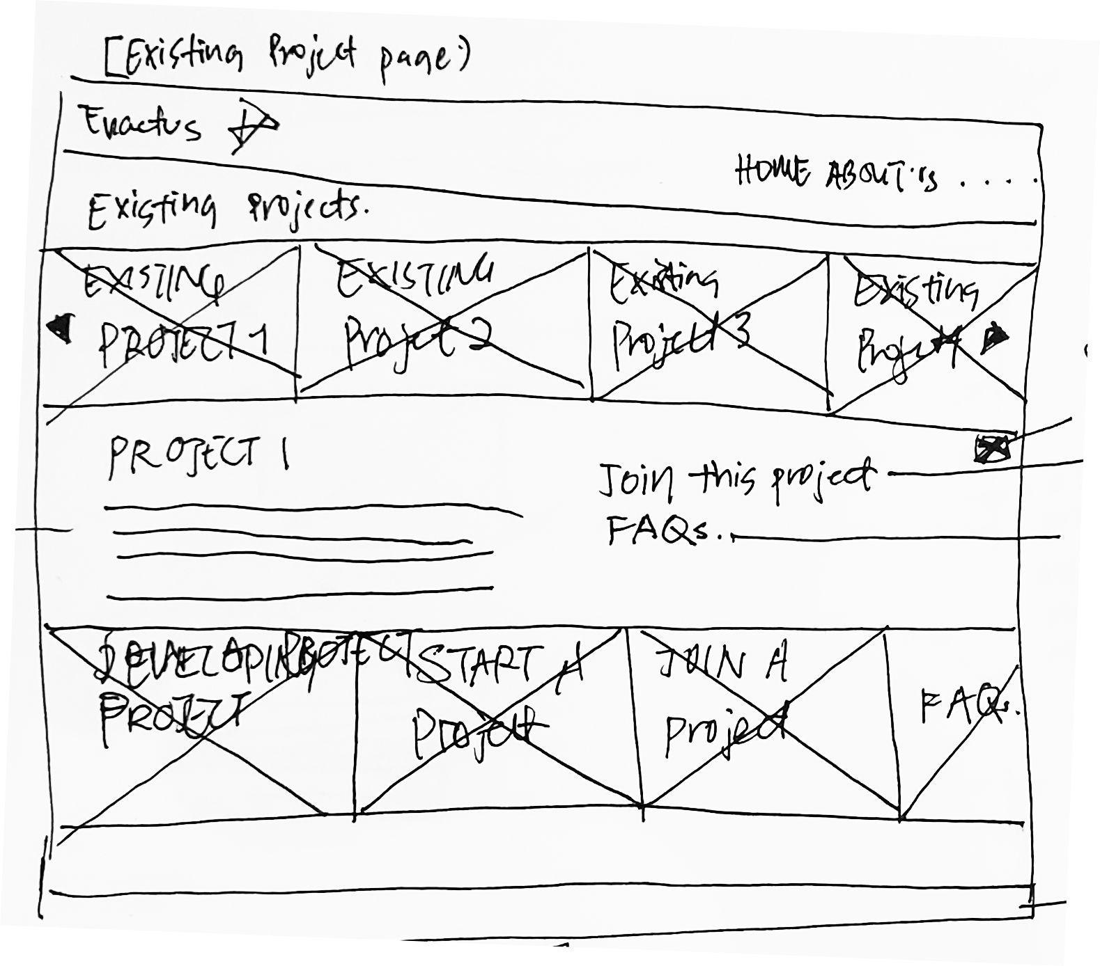
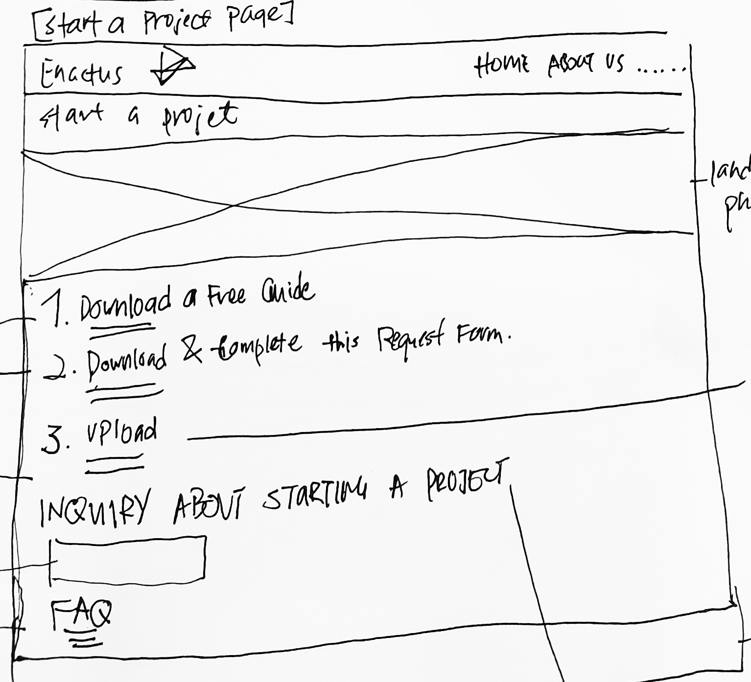
After the discovery, I decided to work on the ‘Project’ page, hoping to design a better project page that allows user to view current projects, join a project and start a new project. Another domain that I worked on was the FAQs page, hoping to allow users to get relevant support about the organisations
and questions.
Sketches


Wireframes


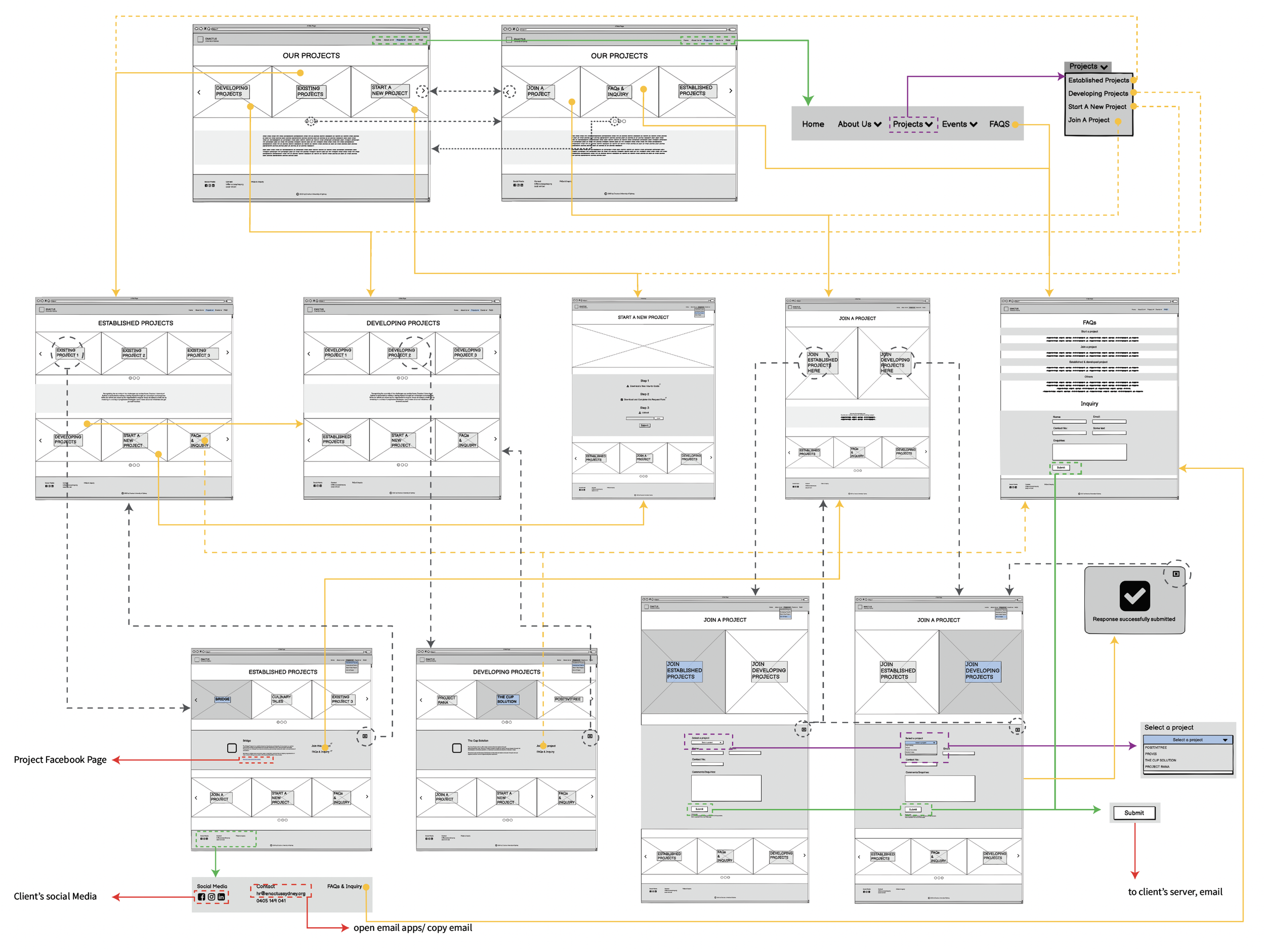
Wireflow
Iterations


yep, it’s a link
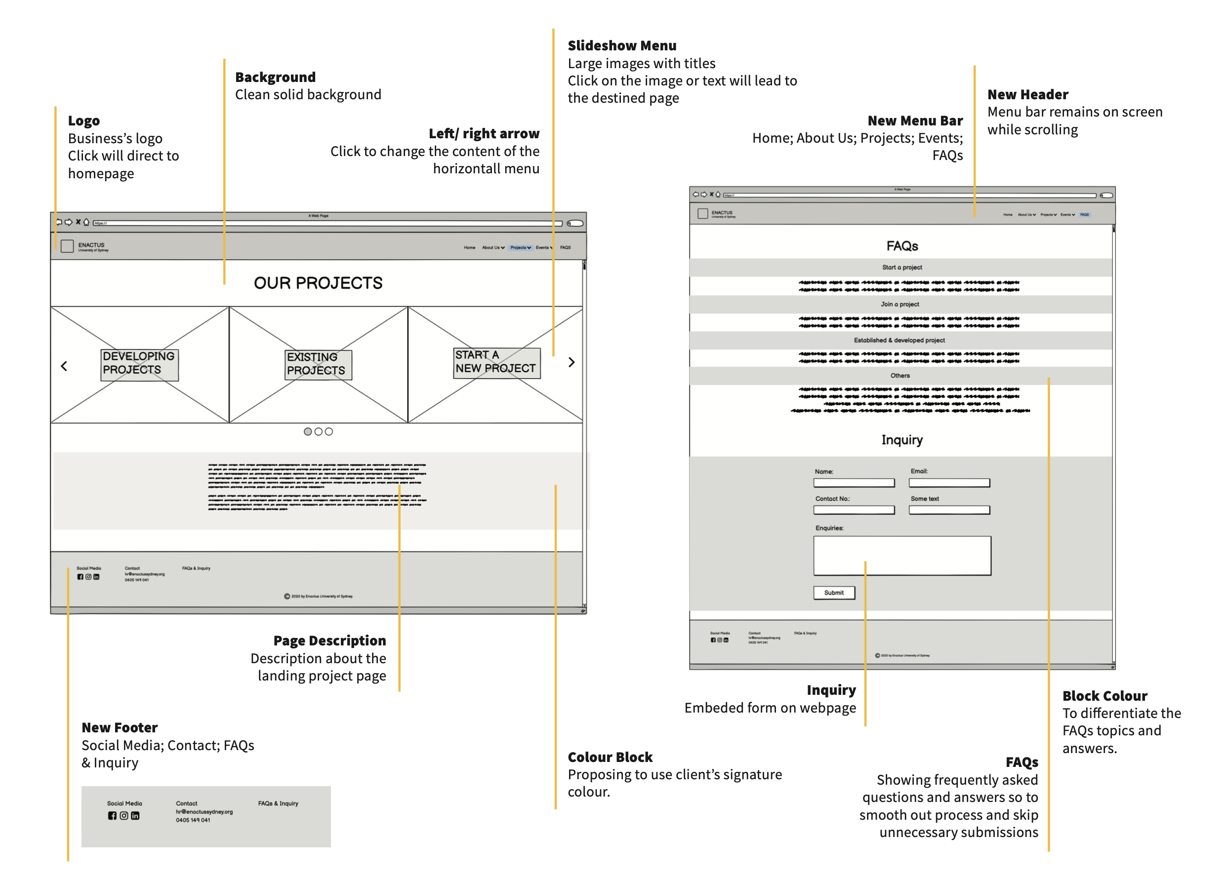
Landing page - project page
For a simple and clean yet proffessional approach, we chose to use greyscale images complementing the primary colours, which can provide users with clean visuals. To hint users which areas are clickable, enlarged images when hovered are implemented as we find there isn’t any prompts hinting users where to click in the client’s website.

Developing project page
Rather than placing all projects contents in a single page (like the current website), we divided developing projects and established projects into two seperate pages. This is to suggest a clearer visual and easy navigation. Also we implemented a drop-down box for every selected project rather than having every project’s details on a single page, which is a way we used to better organise contents.

Join a project page
Join A Project page is also a new feature we introducted to the project page. Here, users can select either to join an establish project or developing project. We separated into two options because we thought that it’ll be easier for our client to sort out submissions. Here, we also implemented a drop-down block with a Project Interest Form, users can express their interest through this form.

Start a project page
Start A Project page is a new feature that we implemented to the project page. It is to help users who want to start a project or have questions about starting a project. We implemented easy steps for users. Users are able to download relevant resources, upload files and submit to the client’s server.

Wireflow


—terima kasih—