
About My Brain 🧠
About My Brain 🧠
About
-
An end to end project that focuses on an educational piece about brain developments for our client.
The final product is an interactive web design piece that comprised of data visualisation, insights about the different industries responding to the different leadership attributes and a call-to-action promotional piece.
-
About My Brain Institute provides transformational leadership & wellbeing education to develop brain-friendly leaders, teams and cultures. Its mission is to create a brain-friendly world by providing a scalable educational platform that provides skill development in brain-based leadership to help organisations and their people become more balanced, authentic, confident, productive and happier.
The platform, called i4 Neuroleader™ Platform offers a fully resourced virtual learning space designed to develop a new breed of leaders.
-
To create an interactive digital awareness piece that promotes the concept of why it is important to create brain-friendly leaders, teams and cultures in order to create a more conscious, healthier, happier and productive workplace.
A data visualisation component using the results from the i4 Neuroleader Assessment database (dataset is provided by the client)
An interactive visual summary of the learning content presented in the documentary ‘Make Me A Leader’ ( a content must be included). As secondary content, use the 192 tips from the book ‘Leadership Is Upside Down’ and additions content from the book ‘Brain-Friendly Leadership’.
A promotional call to action to guide users to:
Watch the full Documentary
Sign up to the i4 Neuroleader Platform to take the i4 Neuroleader Assessment and gain access to our publications
Become certified in the i4 Neuroleader Methodology to learn more about how to create / promote brain-friendly leaders, teams and cultures
Use the brand, colours, fonts and visual identity from the About my Brain Institute, reference on the website can be found, resources, publications and login website (some graphic assets will be provided).
Research
Apart from understanding our client and going through all the in-house resources, we started by analysing the dataset we acquired from our client. The dataset is based on how the 10 industries respond to the 16 attributes comprised from the i4 Neuroleader Platform pillars (Performance, Collaboration, Innovation and Agility).
Target audience research
We thought, by investigating into the lowest participation data, we could understand more on why the respective industries partook less in the data collection. By emphasising on these industries in our design brief as our target audience, we are able to gain insights for About my Brain and widen the database of these industries.


Diagram 1 : Participation rate of different industries
Diagram 2: Industry similiarities in i4 Neuroleader leadership framework
Findings
We noticed that four industries appeared to have the same siting (low score) on both the Balance and Courage attributes. Hence, we question why do these industries score similar in various leadership aspects; what can we do to understand deeper on these similarities?
Initial hypothesis
Upon reading the explanations of Balance according to Leadership Is Upside Down: The i4 Neuroleader Revolution (Silvia Damiano, 2014), we discovered and hypothesise that time is a significant contributor to the low scoring of the industries on Balance.
Data research & Comparative analysis
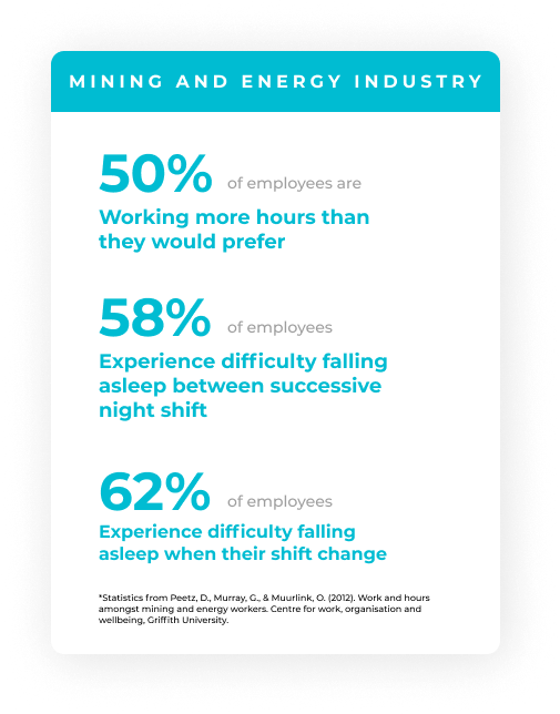
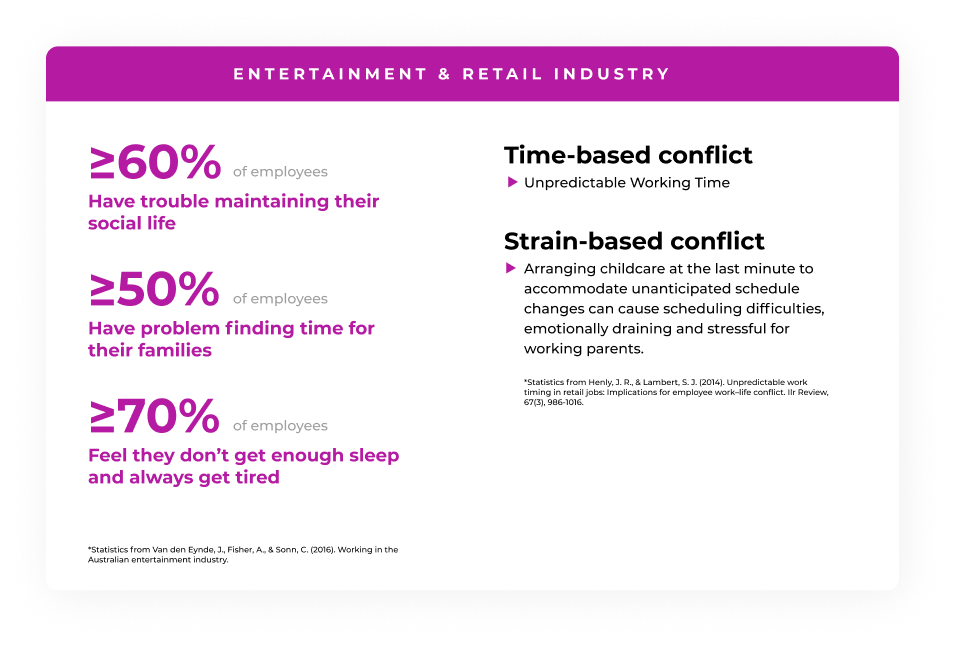
We went into looking at the correlation between Balance and Woking over-time hours in the different industries. Most industries such as Healthcare, AMC & CRE which ranks 1st, 2nd, and 3rd respectively in working overtime, rank bottom lowest in Balance. In contrary, Financial & Insurance services work less overtime yet they score the top in Balance. Not all industries that have lower score in Balance show correlation with their working hours. Henceforth, further research needs to be executed to further justify our findings.


Data analysis & Primary research
We believe that Balance, Courage and Awareness are intercorrelated. Using the Pearson Correlation Coefficient Formula, we justified that these attributes are correlated with each other and seeing that one attribute can influence another. Hence we carried out a primary research reaching out to participants to test out whether or not the strategies in each attribute would affect the other.


Steps that we took:
We looked into the strategies (About My Brain, 2022) for Balance, Courage and Awareness.
We grouped the strategies that show similarities & connections
We generate questions (appendix) and carried our the surveys
Carried out surveys using Microsoft form

16.8 %
23.5%
38.5%
The chart displays the total survey results. These 12 questions are juxtaposed with different attributes. We can see that 62% of the results are from strongly agree and agree. Hence, we can conclude that these attributes are intercorrelated, that one affects another.
Design
After our discovery; Balance, Courage and Awareness are intercorrelated, which means increasing on attribute could also increase the other. This discovery can be leveraged into our design to raise this awareness to About My Brain’s targeted audience, which is tomorrow’s leaders.
Design precedences
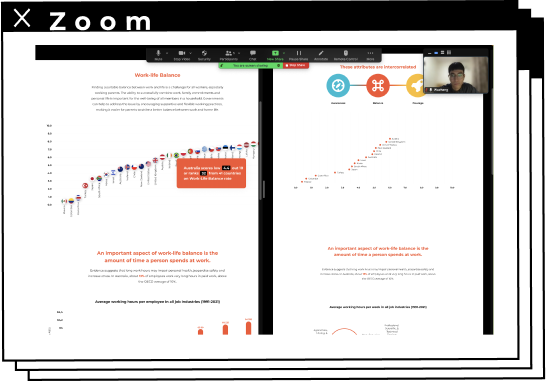
We looked into various designs that articulate data into their web designs. One thing that attracted us was that the data visualisation interacts with the scrolling of the webpage. The other thing that inspired us was the use of hover to display data and interaction.

Are Pop Lyrics Getting More Repetitive? by Colin Morris
The Naked Truth by Offune Amake, and Amber Thomas

Who’s in Your Waller? by Alejandra Arevalo, Eric Hausken and Jeff MacInnes
Branding & typographies
Using AboutMyBrain’s visual and brand Identity, such as fonts and colour palettes. It is important to design a mocks for our clients without changing their brand identity. The font sizes, margins and columns used in AboutMyBrain’s website are inconsistent. Hence, we proposed new font sizes, grids, and margins guidelines to increase better user experience of any user’s who’ll come or interact with our mocks that will be exhibited in the website. Having good grids are vital in maintaining websites consistency and improves user experience and readability. We define the grids (padding, margins) by 8 px.


Iterations
After defining our design scope, we started our journey in visual design and user interface design. Considering all the elements of user experience design and brand identity with typographies, we carried out various iterations in our design process.

Wireframes

Data visualisation moodboard

Iterations
A/B Testings
After having some design iterations, we involved A/B testings to test our users responses to the interactive data visualisation and web design. We tried to test our mocks by inviting people/friends outside of this subject into one zoom link and ask them to share their opinion and thoughts about our prototype. We wanted to get insights about which mocks works the best, which aspects or interaction that they like the most. On a/b testing, we also ask them to think aloud and share their thoughts and discuss about which mocks that they like / dislike (or how we can improve).
Steps that we took:
Picked two versions of our hifi mocks
Participants skim through and observe both versions
Think-aloud method (their opinions)
Asked participants open-ended questions.
Completed the SES questions.


Findings
Users find that the scrolling with changing texts and data visuals appealing.
Displaying one information at a time with a data visual sitting next to it makes it much easier to understand.
All of the users liked the video introduction displaying at the top, making it feel momentum.
The iterations with better grids and hierarchy, seems more visually appealing and enhance user’s experience in using the website.
Future improvements
Build mobile version;
Incorporated with better marketing campaign strategy;
Possibility to make documentary/video project about this theme;
Implant data tracker to see sign up rate or engagement rate.
Final prototype
Video prototype


Hi-fi mocks
